GIZMO Calendar
The goal was to redesign a popular calendar app facing usability issues, complex navigation, and lack of customization. As a Senior UX Designer, my role involved user research, redesigning the information architecture, creating interactive prototypes, and conducting usability tests.
September 12, 2024
Senior UX Designer, Product Lead, UI Designer.
Figma, FigJam.
01
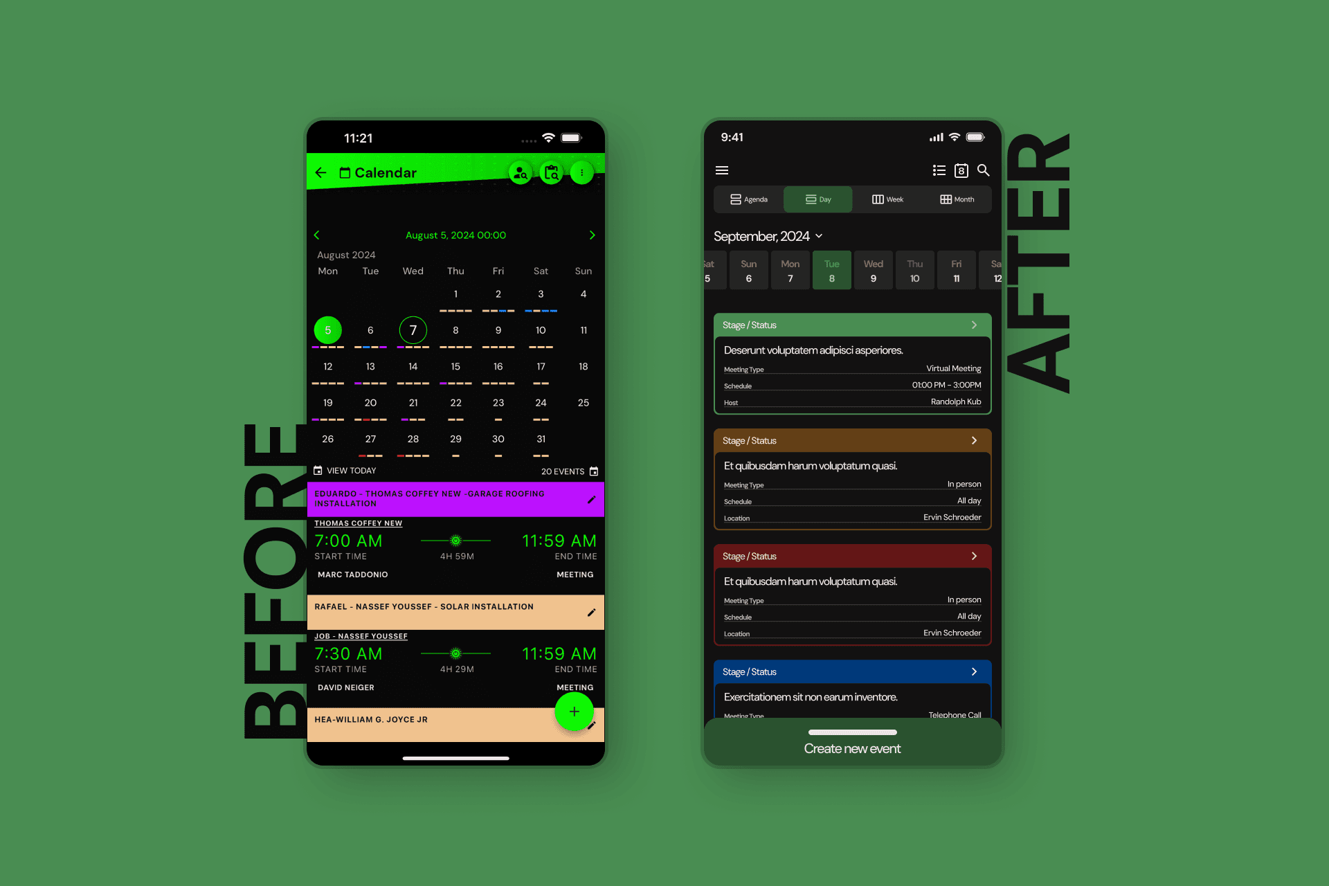
Problem Statement
Users found it difficult to switch between day, week, and month views, struggled with an overloaded interface, and lacked customization options. As a result, many abandoned the app. The redesign aimed to simplify navigation, reduce visual overload, and offer customization for a better user experience.
02
User Research
User Persona: Laura Martínez
Age: 32 | Occupation: Project Manager | Tech Proficiency: Medium
Frustrations: Difficulty managing multiple calendars and switching between views. Lack of customization.
Needs: Clear, easy-to-use interface, quick event creation, and personalization options.
User Journey Map (Summary)
Discovery: Finds the app; faces a steep learning curve due to complex navigation.
Exploration: Struggles with syncing personal and work calendars.
Planning: Frustrated by multiple steps required to create events.
Daily Use: Difficulty navigating between views.
Personalization: Disappointed with limited customization options.
Evaluation: Considers alternative apps due to inefficiency.
Key Pain Points & Insights
Complex Navigation: Switching between views (day, week, month) required multiple clicks.
Solution: A simplified navigation bar for instant access to different views.
Visual Overload: Overcrowded interface.
Solution: Display only essential information for the selected view.
Slow Event Creation: Multiple steps slowed users down.
Solution: Quick event creation button accessible from all views.
Limited Customization: Users couldn't personalize their calendar.
Solution: Added customization options like themes and view formats.
Confusing Calendar Syncing: Managing multiple calendars was difficult.
Solution: Streamlined multiple calendar management and syncing.
04
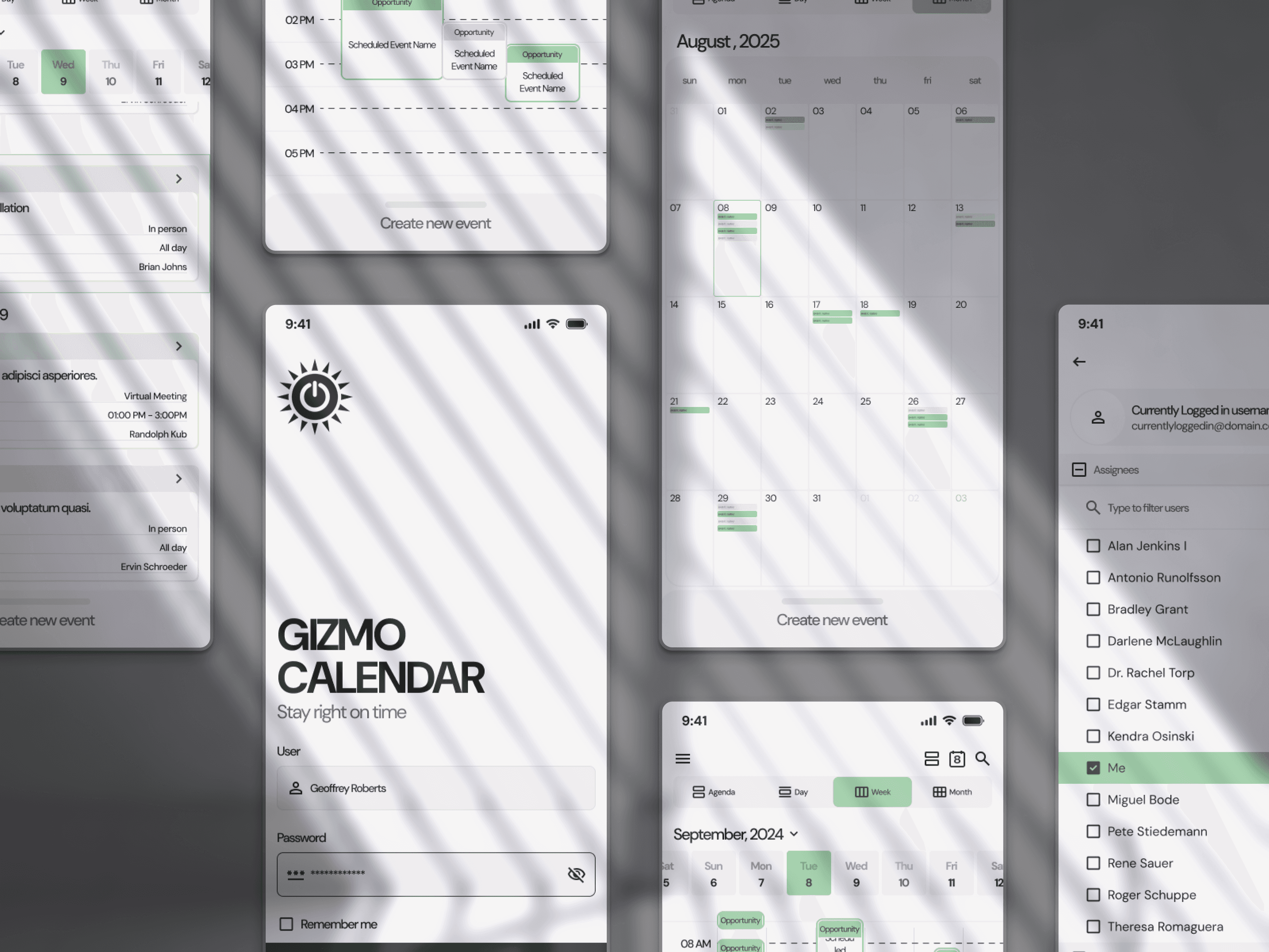
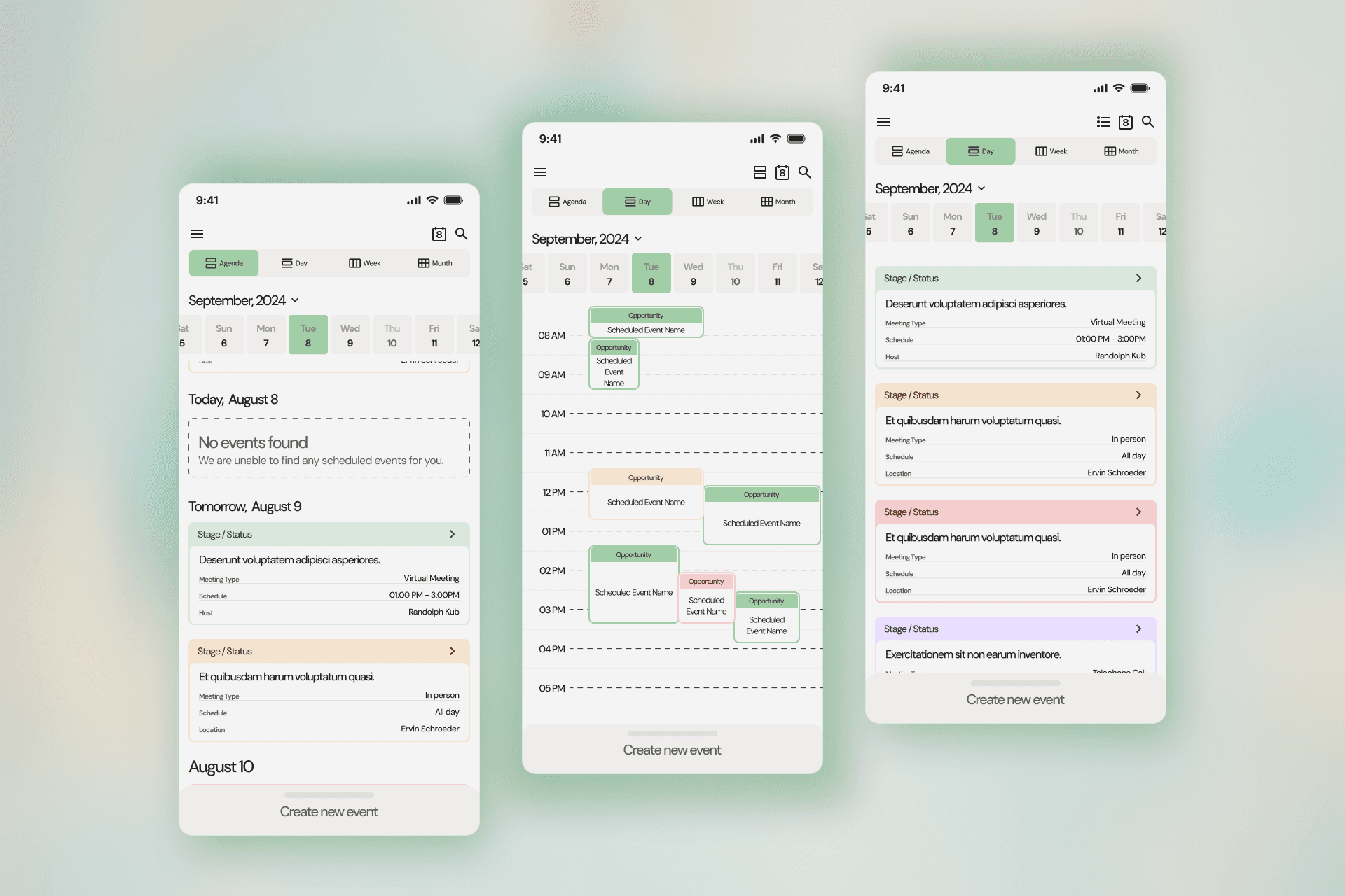
Solution
Design Process
Information Architecture: Simplified navigation, grouped key actions (event creation, view switching, calendar syncing) into a fixed bottom bar.
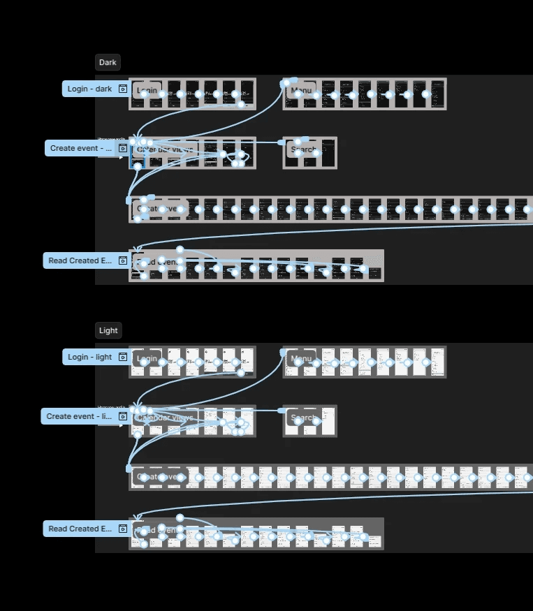
Wireframes & Prototypes: Low-fidelity wireframes followed by high-fidelity prototypes in Figma, focusing on improved interactions.
Usability Testing: Multiple rounds revealed significant user satisfaction improvements, reducing event creation time by 30%.
Final Design Highlights
Navigation: A bottom bar with easy access to day, week, and month views.
Quick Event Creation: A floating action button to create events from any screen.
Customization: Users could choose color themes and adjust view formats.
01
Conclusions
Impact
25% increase in user retention in the first 3 months.
40% reduction in event creation time.
85% user satisfaction with the redesigned interface.
Lessons Learned
Iterate constantly: Usability testing at multiple stages was key.
Simplicity matters: Simplifying the interface led to better adoption.
Listen to users: User research guided the redesign to meet their expectations.